
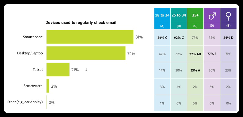
One thing that hasn’t changed in email marketing is the use of responsive HTML email templates. Building HTML emails is no shorter than defying the rules of web designing and thus, we decided to come up with a few hacks for our community. Today, I am going to share insights into how to tackle compatibility differences arising between different email clients and devices. Keeping your messages responsive is a must for great customer experience and reaching out to the mobile users. Here’s an infographic explaining the need of mobile responsive optimization:
Buckle up to explore 13 tips to design fabulous responsive HTML email templates down below:
Use Small Image Size In A Proper Layout
You should use a small image size and plan for going image-free due to two reasons: Most email clients strip off the images or keep them turned off by default. The second reason is the uneven Internet bandwidth. You can still use them as complementary elements without any functional effect. Place the images toward the left and keep all the text on the right for better visibility. Avoid using images in the background.
Use Alt Text Appropriately
In case your image doesn’t load, Alt Text comes handy. Try to keep it as short as possible because many email clients don’t display Alt Text above two lines. I also advise you to style your Alt Text with particular alignment, font size, and color corresponding to the image. It helps convey your message better.
Also Read: Email Marketing Trends to Expect in 2020
Code With The Help Of HTML Tables And Nest Them
Another area for compatibility issues is that div tags are not supported in emails. You can use the table tags to bypass this problem. Moreover, interpretation margins and padding differs for every email client so nesting your tables to a maximum of 8 is a difficult yet effective strategy.
Use Inline CSS
Major ISPs consider external style sheets as potential threats. Put the CSS elements inline and don’t use modern CSS elements as not every email client supports them. Add the attribute for all elements in their respective tags and even tables to ensure that your message rendering isn’t compromised due to syntax issues.
Embed Call To Action Button Smartly
A great HTML email code always ensures that the CTA button is well recognizable. You should place your CTA at a higher position and preferably keep their sizes larger than normal ones. As we discussed earlier, using an image as CTA could end up a disaster, so refrain from doing so. People don’t prefer clicking or tapping on “click here” CTAs so directly put the desired action with supportive text viz. “Contact Us” or “Buy Now.” Repeating your CTA is okay if your message is a long one as it adds convenience to the UX. To cater to mobile subscribers, your CTA button should be 44x44px at the minimum so that it is easily tappable with the thumb.
Double The Size Of Your Logo
Place the logo at the top of your message and double its size. I know that I advised against using large image sizes but the logos are an exception to it. Usually, designers skim down the entire emails in terms of the image and overall size of the elements but keep call-to-action buttons and logos big enough.
Follow The 600px Width Limit
Preview panes of many email clients are limited to a width of 600px. Also, the message is displayed on a side screen by some email clients which also limits the area to 600 pixels. Keeping your table tag/ CSS width property limited to 600px is an unwritten rule that helps tackle every screen-provider combination.
Also Read: Run Unstoppable Instagram AD Campaigns to Leverage Existing Email List in 2020
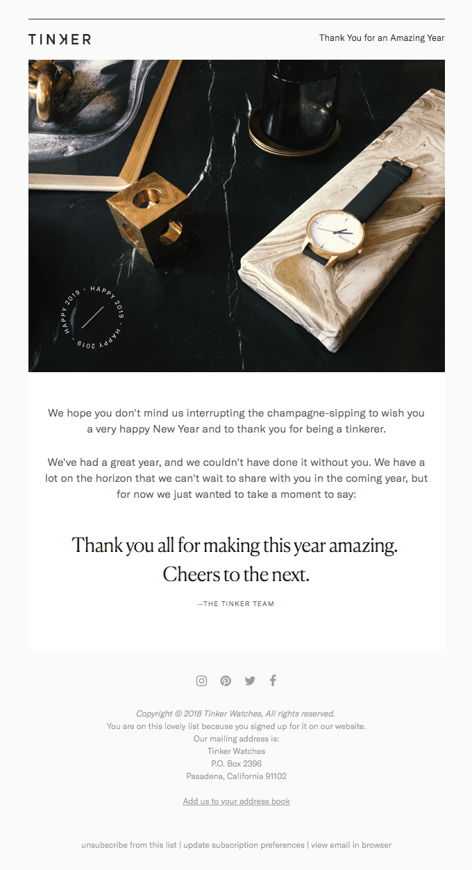
Stick To Single Column Layout For Your Template
Single column layout is favorable for both the designers and users alike. For designers, it is easy to format the copy in one column while it also adds to the ease of reading on mobile devices. They are visually more impactful but you can add up to 3 columns in extreme cases. I also recommend using a grid to make designing intuitive and quick. You can have a quick glance at this emailer from Tinker Watches to see the effectiveness of the single-column layout:
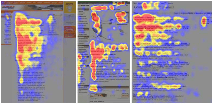
Use HTML Standard Fonts And F Layout
I know that many companies develop their custom fonts but it is not a good idea to use them in email templates. Even the changes in the custom font’s size from default fonts will muddle the alignment. I strongly recommend using standard fonts like Arial, Verdana, and Georgia as they are supported by all email clients, Operating Systems, and devices. You can keep the font size at around 13 or 14 pixels for best results. Use the F layout for your text as it helps in having a quick glance and follows the natural reading pattern. Have a look at the following heat map to understand how our eyes move while going through any piece of content.
Leverage Preheader Text
Preheader text is like the meta description for emails. You should always add a 40-50 word long preheader as it helps the recipients to quickly decide why they should open your message. Keep it concise, clear, and engaging to boost your open rates.
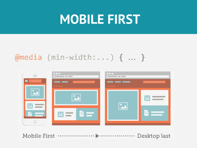
Add Media Queries
This is one of the inline CSS techniques used to display optional codes to selective devices. You should follow the 600px*480px layout principle to support all resolutions and orientations of devices. This is vital for making your design responsive and it shall be followed without fail. The following image illustrates the effect of media queries and how they help optimize your messages for all screen sizes and orientations.
Avoid Menu Bars And Stacking Links
We should always take into account the fact that people tap on their smartphone screens which isn’t position-sensitive unlike using a mouse to click. Menu bars are therefore a complete no as they do more harm than good. Stacking links to your social media handles isn’t a good idea either owing to the same problem. Avoid placing links in close proximities to save your audiences from mistakenly clicking on them and getting frustrated.
Test How Email Renders Across Platforms And Multiple Devices
Testing your email template across the email clients and devices is a must. Adding to it, cross-browser testing and checking compatibility for all leading webmail clients can be cumbersome. So consider using a tool like Litmus. It supports over 30 leading email clients including Google, Outlook, AOL, and Yahoo. It renders your email across windows and Mac devices. It also covers smartphones and tablets with both iOS and Android all at once. To verify your code’s conformance to general best practices follow the guidelines from The Emails Standards Project.
Wrap Up
I have tried to bring almost all of the useful pieces of advice on the table and would like to point out two similarities across them: simplicity and compatibility. Often we all want to pour in the best of our efforts but it is necessary to align them with the user experience. Our job as designers is to ease the reader’s journey and make it as predictable as possible. I hope that you find these 13 tips useful in designing your next responsive HTML email template.
Also Read: EmailChecker Review: Easy and Effective Email Verification Service


